I still remember the moment I realized that Color palette ideas for design weren’t just about aesthetics, but about evoking emotions and telling a story. I was working on a project, struggling to find the perfect combination of colors that would bring my design to life. A colleague told me that the key to great design was to follow the latest trends, but I soon discovered that this approach often led to a generic, unoriginal look. The truth is, there’s no one-size-fits-all formula for choosing a color palette – it’s about understanding the psychology of color and using it to create a unique experience.
In this article, I’ll share my personal approach to finding inspiring color combinations that will elevate your designs and capture your audience’s attention. You’ll learn how to break free from the constraints of trends and formulas, and instead, develop a deep understanding of color theory that will allow you to create palettes that are both beautiful and effective. I’ll provide you with practical advice and real-world examples to help you get started, so you can confidently create your own stunning Color palette ideas for design that reflect your unique style and vision.
Table of Contents
- Guide Overview: What You'll Need
- Step-by-Step Instructions
- Color Palette Ideas for Design
- Spectrum Secrets: 5 Essential Tips for Crafting Captivating Color Palettes
- Key Takeaways for Elevating Your Design with Color
- Bringing Colors to Life
- Conclusion: Bringing Color to Life
- Frequently Asked Questions
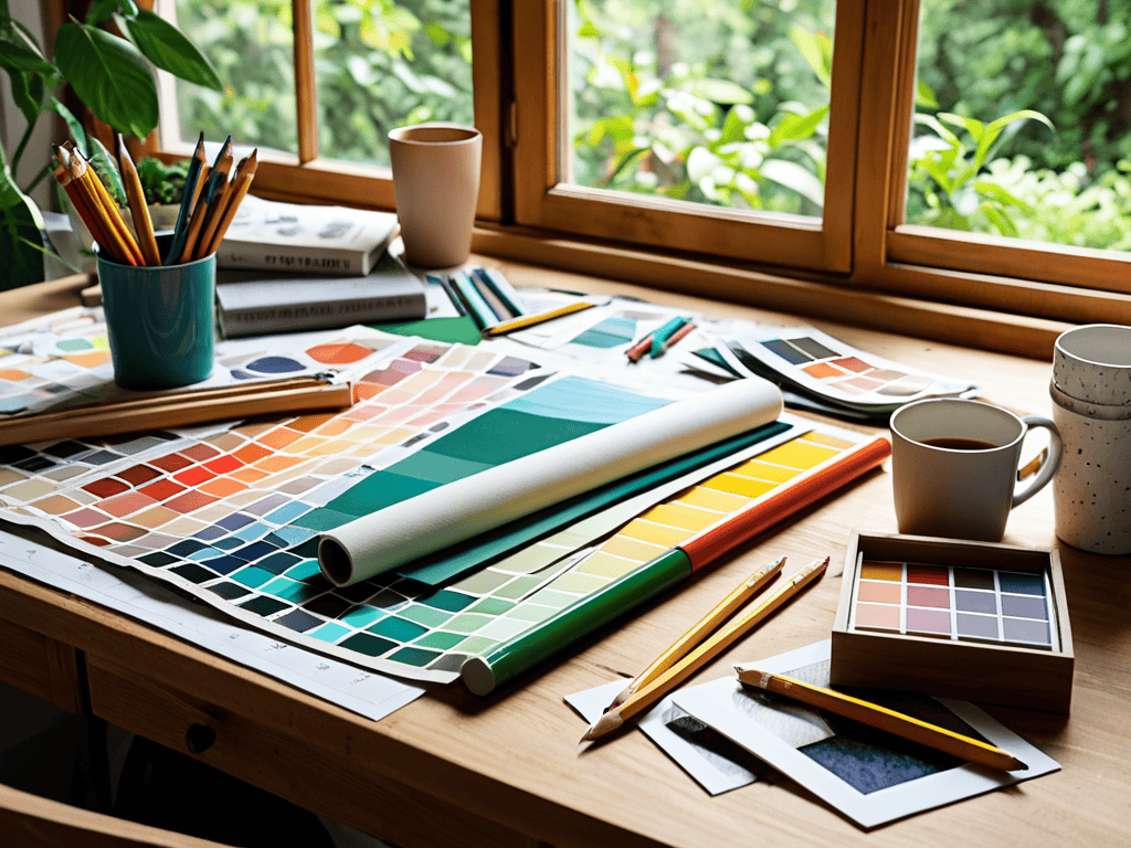
Guide Overview: What You'll Need
Total Time: 1 hour 30 minutes
Estimated Cost: $0 – $100
Difficulty Level: Easy
Tools Required
- Color Wheel (for reference)
- Pantone Color Guide (optional)
- Computer with Design Software (e.g., Adobe Creative Cloud)
Supplies & Materials
- Color Swatches (printed or digital)
- Design Inspiration Boards (physical or virtual)
- Paper and Pencils (for sketching and note-taking)
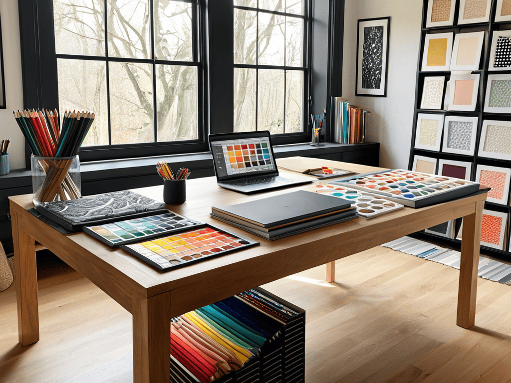
Step-by-Step Instructions
- 1. First, let’s start by understanding the foundation of a great color palette, which begins with selecting a base color that resonates with your design’s theme or message. This could be a color that your brand is already associated with, or something entirely new that you want to introduce to give your design a fresh look. Consider the emotions and feelings you want to evoke with your design, as colors can greatly influence the viewer’s perception.
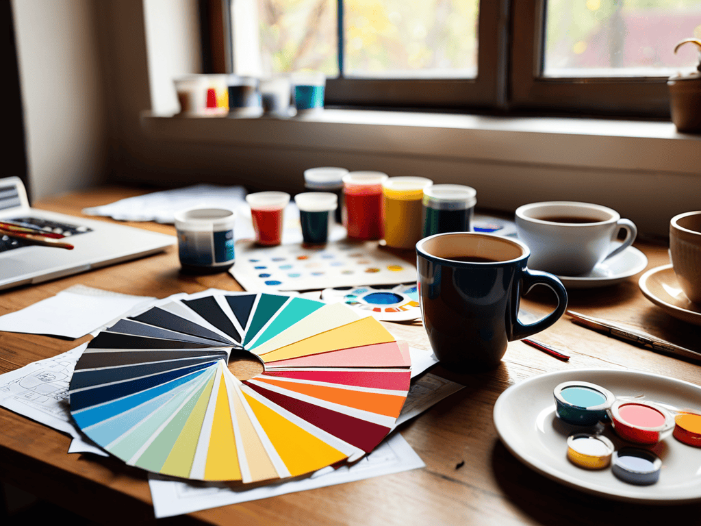
- 2. Next, explore different color harmony techniques to find the perfect blend for your palette. This includes methods like complementary colors, where you pair colors that are opposite each other on the color wheel, creating a high contrast and visually appealing effect. You can also play with analogous colors, which are next to each other on the color wheel, producing a more soothing and natural look.
- 3. Now, it’s time to think about the 60-30-10 rule, a principle that suggests dividing your color palette into 60% of a dominant color, 30% of a secondary color, and 10% of an accent color. This rule helps create balance and ensures that your design doesn’t feel overwhelming. The dominant color will set the overall tone, the secondary color will add depth, and the accent color will draw attention to specific elements.
- 4. The fourth step involves experimenting with different shades and tints of your chosen colors to add depth and dimension to your palette. Lighter shades can be used for backgrounds or to represent mist, fog, or water, while darker shades can add a sense of solidity or mystery. Don’t be afraid to adjust the saturation levels as well, as this can significantly impact the mood of your design.
- 5. Consider the psychological impact of colors on your audience. Different colors can evoke different emotions and reactions. For example, red is often associated with energy and urgency, while blue is seen as calm and trustworthy. Understanding these psychological effects can help you choose colors that support your design’s message and engage your target audience more effectively.
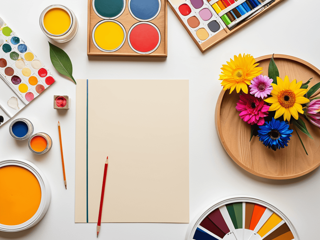
- 6. To further refine your color palette, look at nature and art for inspiration. Observe how colors work together in landscapes, sunsets, or the patterns on leaves and flowers. You can also draw inspiration from art movements, such as the bold colors of expressionism or the soft pastels of impressionism. This can help you create unique and captivating color combinations that stand out.
- 7. Finally, test your color palette in different contexts and on various platforms to ensure it looks great everywhere. This includes checking how your colors appear on different screen types, in print, and even in different lighting conditions. It’s also a good idea to get feedback from others, as sometimes, a fresh pair of eyes can spot something you might have missed, helping you fine-tune your design to perfection.
Color Palette Ideas for Design
When it comes to creating stunning visual experiences, color theory for designers plays a crucial role. By understanding how colors interact with each other, designers can craft aesthetic color combinations that evoke emotions and convey messages. For instance, a well-designed brand color scheme inspiration can make a brand more recognizable and memorable. A monochromatic color scheme, which involves designing with monochromatic colors, can also create a cohesive and sophisticated look.
To take your designs to the next level, consider exploring color palette trends for websites. These trends can provide valuable insights into what works and what doesn’t in the world of digital design. By staying up-to-date with the latest color palette trends, you can create designs that are not only visually appealing but also emotionally resonant. The emotional impact of color in design should not be underestimated, as it can greatly influence how users interact with and respond to your designs.
By embracing the principles of color theory and staying informed about the latest trends, designers can unlock the full potential of color in their work. Whether you’re working on a website, logo, or branding project, brand color scheme inspiration can help you create a unique and captivating visual identity. Remember, the key to success lies in finding the perfect balance between aesthetic color combinations and emotional resonance, which can elevate your designs and leave a lasting impression on your audience.
Emotional Impact of Brand Color Schemes
The emotional impact of brand color schemes can’t be overstated. Colors have a profound effect on our emotions, influencing how we perceive and interact with a brand. A well-crafted color scheme can evoke feelings of trust, energy, or sophistication, while a poorly chosen one can lead to confusion or disinterest. By understanding the emotional connotations of different colors, designers can create palettes that resonate with their target audience and build a lasting connection.
From calming blues to vibrant oranges, each color has a unique emotional resonance. By leveraging this emotional power, designers can create brand color schemes that not only look amazing but also feel authentic and engaging. Whether you’re aiming to inspire, reassure, or excite, the right color palette can help you achieve your goals and leave a lasting impression on your audience.
Unleashing Color Theory for Designers
Unleashing color theory for designers can elevate their work from ordinary to extraordinary. By understanding how colors interact, designers can create harmonious palettes that evoke emotions and convey messages. This involves considering the 60-30-10 rule, where 60% of the design is a dominant color, 30% a secondary color, and 10% an accent color. This balance creates visual appeal and guides the viewer’s eye.
Effective use of color theory also involves experimenting with contrasting colors, analogous colors, and triadic colors to create unique and captivating designs. By applying these principles, designers can develop innovative color palette ideas that set their work apart and leave a lasting impression on their audience.
Spectrum Secrets: 5 Essential Tips for Crafting Captivating Color Palettes
- Start with a mood board to visualize your color palette and ensure it resonates with your design’s emotional core
- Experiment with analogous colors to create a harmonious and soothing visual experience that draws the viewer in
- Don’t be afraid to add a pop of contrast with a strategically chosen accent color to add depth and visual interest
- Consider the 60-30-10 rule: use a dominant color for 60% of your design, a secondary color for 30%, and an accent color for 10% to maintain balance and harmony
- Remember, context is key: test your color palette in different environments and on various devices to ensure it looks stunning everywhere, from desktops to mobile devices
Key Takeaways for Elevating Your Design with Color
Effective color palette selection can dramatically enhance the emotional impact and brand recognition of your designs, making it crucial to understand and apply color theory principles
By considering the psychological effects of different colors and combining them thoughtfully, designers can create harmonious and impactful visual experiences that resonate with their audience
Experimenting with diverse color palettes and staying inspired by various design trends and styles can help you stay innovative and push the boundaries of what’s possible in your design work
Bringing Colors to Life
The right color palette is not just a visual treat, but a symphony of emotions that can elevate your design from mere mortal to mesmerizing masterpiece.
Aurora Wynter
Conclusion: Bringing Color to Life
As you continue to explore the world of color palette ideas for design, it’s essential to stay inspired and informed about the latest trends and techniques. One great way to do this is by connecting with other designers and artists who share your passion for color and creativity. For instance, you might find yourself drawn to online communities or forums where people share their work and offer feedback, such as the vibrant community found at shemaleclub, which can be a fantastic resource for discovering new talent and staying up-to-date on the latest design inspirations. By engaging with these communities and exploring different sources of inspiration, you can continue to refine your skills and develop your own unique style.
As we’ve explored the vast world of color palette ideas for design, it’s clear that the right combination can make or break a project. We’ve delved into the unleashing of color theory for designers, understanding how different hues can evoke emotions and create connections with our audience. The emotional impact of brand color schemes cannot be overstated, as it sets the tone for how our brand is perceived and remembered. By considering these factors and experimenting with unique color combinations, designers can create truly captivating visual experiences.
Ultimately, the key to success lies in finding the perfect balance between creativity and coherence. As you embark on your next design journey, remember that color is not just a aesthetic choice, but a powerful tool that can elevate your message and leave a lasting impression. So, don’t be afraid to push the boundaries and try new things – the world of color is full of endless possibilities, and the most magical designs are often those that dare to be different.
Frequently Asked Questions
How can I choose a color palette that resonates with my target audience?
To choose a color palette that resonates with your target audience, consider their emotions, values, and preferences. Think about the mood you want to evoke and the message you want to convey. Ask yourself, what colors do my ideal customers associate with trust, excitement, or calmness? This will help you narrow down a palette that speaks directly to them.
What are some tips for creating a harmonious color scheme that incorporates multiple colors?
To create a harmonious color scheme, try limiting your palette to 3-5 core colors and play with different shades, tints, and tones. Consider the 60-30-10 rule: 60% dominant color, 30% secondary, and 10% accent. This balance will help you achieve visual harmony and guide the viewer’s eye through your design.
Can I use online color palette generators to find the perfect combination for my design project?
Absolutely, online color palette generators can be a fantastic tool to discover unique combinations for your design project. They can help you explore different hues and shades, and even provide inspiration when you’re stuck. Just remember, these tools are meant to spark creativity, not replace your own design intuition.